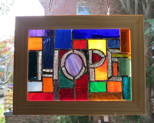
Hope Immersed in a rainbow of glass by Wayne Stratz
I wanted to experiment with a few things. I had not created a stained glass panel of a word in the font, Chelsea Studio, used in most of our recent word mosaic signs.
- How would the design flow around the letters?
- How would word show up if used in clear glass?
As a test run I am quite happy, the letters led to a patchwork background design, which matches the Arts and Crafts feel of the lettering.
I also learned that a large variety of glass works as background to clear glass letters, but some work great and a few should move farther away from the edges of the letters.
Clearly, more to come in the future.